Disney’s New Maps – A Closer Look
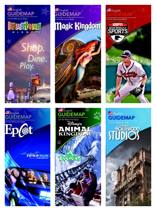
Last week, Scarlett gave you a sneak peek of the new maps Walt Disney World launched on Sunday resort wide. But let’s examine this update more closely and what it has to do with your future touring.
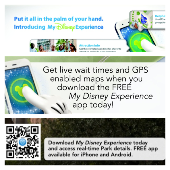
The new maps have everything to do with Disney’s upcoming billion dollar Next-Gen project, MyMagic+. This program is designed to create a seamless experience from your pre-planning at home to your tablet or smartphone to the moment you step on property to reliving the memories long after you’ve departed.
As you can see, Disney is really pushing for you to download their free My Disney Experience app for your Apple or Android device with QR codes and ads throughout the map.
The map interface itself is designed to match what you would reference within the application. This is a departure from what we’ve grown accustomed to, most notably because the park geography has been rotated so that the northern end is located at the top of the map.
|
|
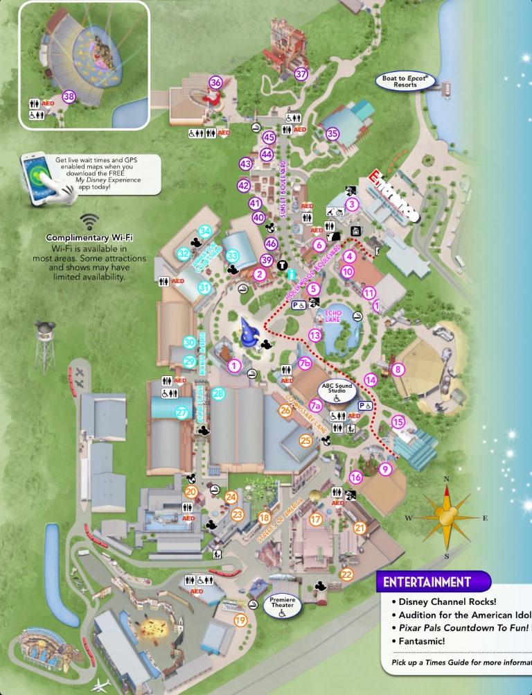 |

Previously, the park entrance would usually be presented at the bottom of the map. It will be interesting to see how many guests having just entered the turnstiles immediately turn their park map upside down or at an angle to orient themselves!
The maps feature a bevy of updated icons and descriptions to find destinations for special activities and all your dining and shopping needs. Want to know where you can get a churro in Epcot or an engraved towel in Hollywood Studios? What if your child wants to see the monkeys in Animal Kingdom? The map can help with that!

The maps will even help you AFTER you’ve left your destination! There are clearly labeled markers and instructions that tell you how to get back to your car or anywhere else you might want to go on property.

What do you think of the new maps? Better? Worse? Let us know!
You May Also Like...
-

We love being in the parks, and enjoy bringing you along with us through our social media posts. With so much…
-

Earlier this week, I had a work assignment that took me out of my home for the first time in. .…
-

This week, multiple new series of Wishables made a debut at Walt Disney World. Wishables are cute plush collectibles that retail…
-

I've said that in a weird way, due to the Coronavirus pandemic, it's kind of a nice reset for the Walt…
Well, I like the new orientation – North is up, as it is on most maps. This makes it line up with Google Maps, GPS, MDE, etc. I also like the new HS map – it seems much clearer to me.
I’m sure we’ll get used to the maps, but it does seem odd not having the park entrance at the bottom of the map.
The most surprising part of this, though, is the QR codes. Nobody ever scans QR codes. Last summer, some friends of mine stood outside a San Francisco Giants game promoting their startup by handing out postcards with their URL and a QR code on them. They handed out nearly 10,000 cards and got about 1500 new visitors to their web site.
And how many people scanned the QR code? One: the person who designed the postcard, to make sure it worked.
In the most tech-heavy environments you could imagine, not one of 10,000 people who saw the QR code scanned it. SMS short codes (e.g., “text ‘MKLUNCH’ to 12345”) have a much better conversion rate.
Map orientation aside, there is another difference that seems very significant to me. There is no mention of FASTPASS anywhere on the new map other than the map legend and FASTPASS icon for attractions. Implies to me that the current FASTPASS system will be going away entirely when FP+ starts.
I really hope they change these before my trip. They certainly aren’t as cute as they were before, but that isn’t what I am upset about. It’s just going to be folded, and crinkled, and eventually recycled.
I am very upset about the layout- it’s just unusable.I can’t even figure out where the entrance to HS is on the map. How am I supposed to use it to navigate? I’m a pretty inteligent person, whose been to Disney multiple times, and I can’t figure out. I feel sorry for the newbies.
I mispelled intelligent… ha
I guess we should just be thankful MK is positioned the way it is, or else we’d be looking at the back of the castle? They would never have done that to MK, so why is it acceptable for the other parks? Looks stupid. I’m not one of those elitist, nit-picky Disney fans, either. But just looking at the comparison between the old and new HS map, the old one gives you a sense of grandness with the entry / Hollywood Blvd., highlights the different themed areas (which, it’s almost despicable that the new generation barely shows), AND serves as a nice souvenir to show friends at home.
Now, who would collect these new maps, shown from a severe overhead angle that makes it look like a Google Maps satellite map? Does it not make DHS actually look MORE confusing? Is it hyper-accurate? Yes. But it’s not “beautiful” or bright or fun. People don’t orient themselves by cardinal directions, always aware of which way north is – they orient themselves by landmarks. The old map made landmarks (like the Chinese Theatre, Earful Tower, and HTH) clear while the new one is just a bunch of sound stages for the sake of “accuracy.” Not a fan, and I don’t see how I could ever become one…
“that makes it look like a Google Maps satellite map”
That’s because it IS a Google map. The online maps are powered by Google and it appears that Disney copied them to the handouts for conformity.
I understand the unity between the maps and the app, but would it really have hurt to rotate DHS and Epcot to be presented “normally?” New map designs come around now and again and are usually not accepted very warmly, and it’s true that I enjoy the more “animated” and whimsical style of the old ones compared to the almost overly-accurate, GPS style new ones. Seems a little like innovation for the sake of innovation, and I’m surprised that somewhere along the line someone didn’t stop this and say “Let’s at least rotate the maps to their traditional directions.” I think that may still happen, honestly. The DHS map is… wow.
I was at the parks last week when the new maps rolled out. I am thankful I already know the parks, because these maps would have confused the heck out of me if I was trying to find something! They seem upside down, and I don’t understand why they did them this way. It is going to confuse inexperienced park visitors.
The “north” thing is a bit bizarre. I do agree that upon entry to the Studios or Epcot, there will be a bevy of people holding their maps upside down.